Services
Branding
Naming
Time
30 days
Client
Entreclínicas
Team
Creative Direction
Julia Sprioli
Design and Illustration
Julia Sprioli e Sol Paiva
About_

Research_
Our process began with an in-depth exploration of the psychoanalysis field and the partners vision. We interviewed the psychoanalysts to understand their references, values, and the exchange dynamics they wanted to create. We also analyzed similar spaces and how psychoanalysis visually communicates itself, ensuring that the branding would respect its essence while bringing freshness and authenticity. The name Entreclínicas originates from the value found in the exchanges between psychoanalysts in the time between sessions.

Challenge_
The challenge was to create an identity that conveyed the continuous exchange between professionals, patients, and knowledge. We defined the project statement: "Entreclínicas will be a space for encounters, reflection, and collective construction in psychoanalysis." The naming needed to evoke this flow, while the visual identity had to balance warmth and professionalism, standing out from traditional clinics.

Solution_
To capture this essence, we developed a name that highlights the richness of shared moments between psychoanalysts. The logo's three colored circles and white space visually represent both mental space and the potential for new elements to emerge. The typography was carefully refined, transitioning from a strong-edged typeface to one with rounded corners, improving balance and letter distribution to reflect the organic and welcoming nature of the space. The colors of the circles—red, magenta, and gray—were chosen to create a dynamic yet harmonious interaction. Red conveys energy and presence, magenta introduces a sense of creativity and transformation, while gray provides stability and neutrality, grounding the composition. This interplay of colors visually reinforces the idea of different perspectives coming together in dialogue. The branding was extended to physical and digital touchpoints, reinforcing the experience of exchange and belonging.
The visual identity reinforces this concept through three colored circles and negative space, symbolizing both the mental space and the possibility of a new element integrating into the whole.


Results_
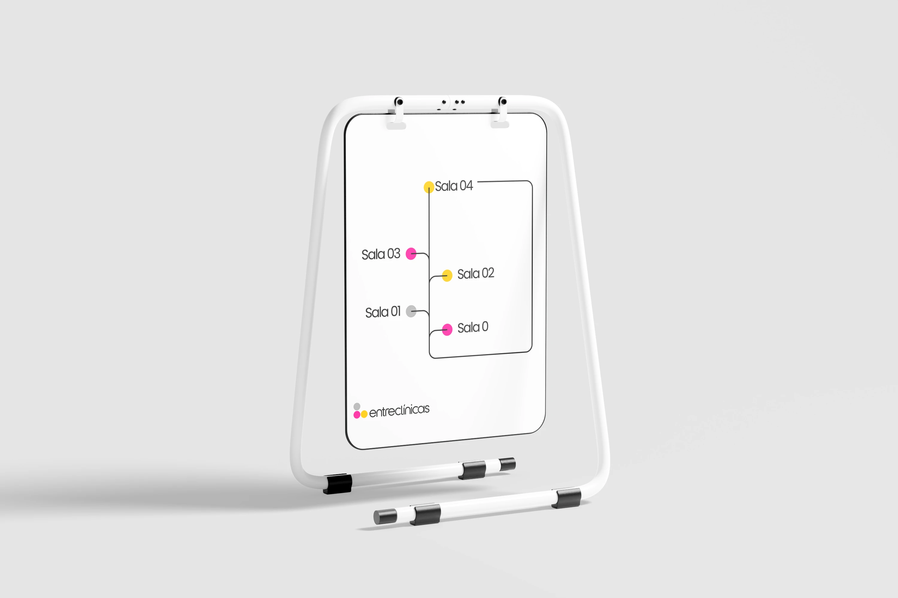
The final identity successfully translated the vision of Entreclínicas into a cohesive and meaningful brand. The fluid forms and balanced color palette created a welcoming yet professional atmosphere. Applied to signage, institutional materials, and the physical space, the identity strengthened the sense of community and became a regional reference for psychoanalytic practice.