Services
Branding
Digital Interface Design
Time
1 month
Client
Bruna
Team
Creative Direction and Design
Julia Sprioli and Sol Paiva
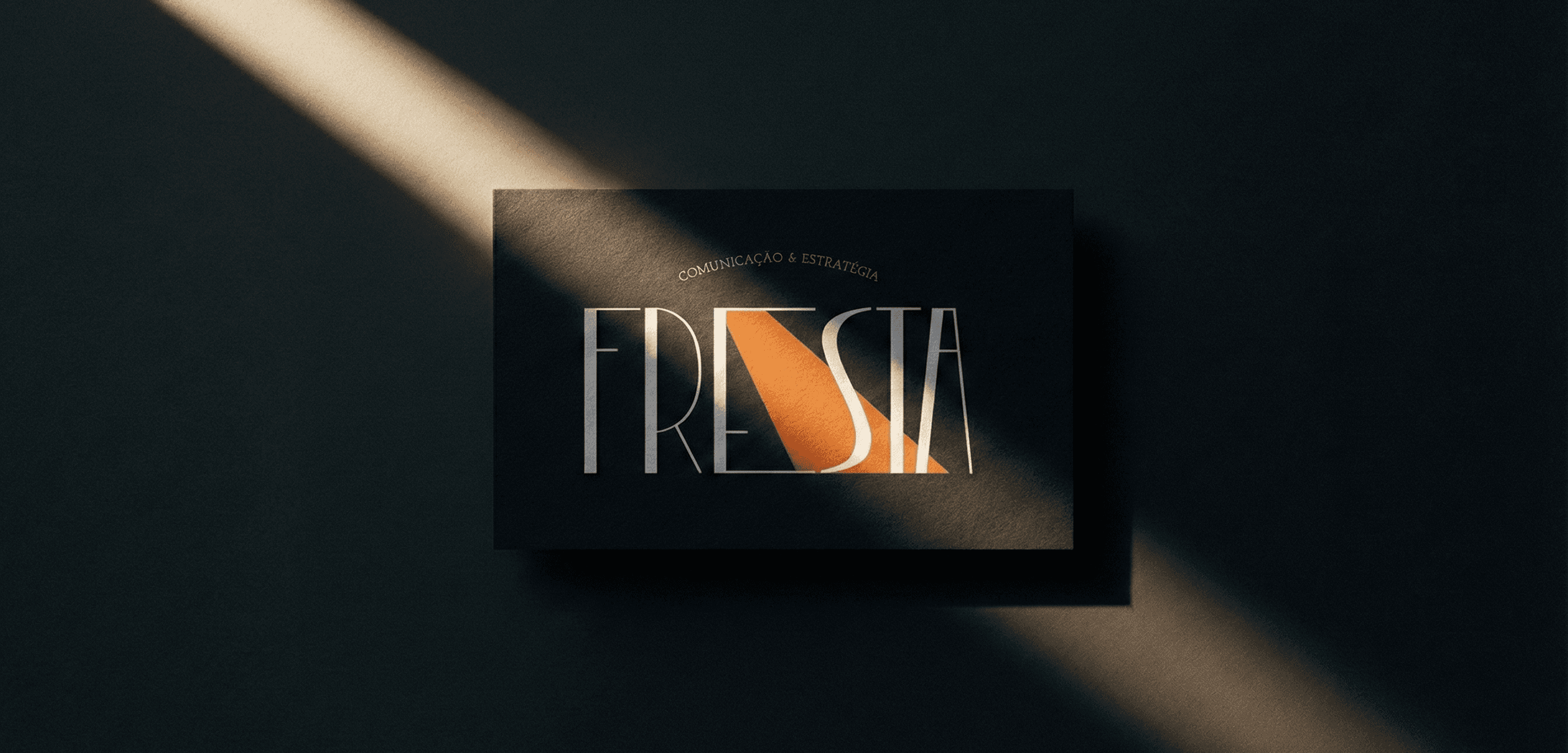
About_
This project focuses on the development of a personal visual identity connected to a specific field of practice: graphic and editorial design guided by research, culture, and critical thinking. Situated within the ecosystem of Fresta, the identity needed to assert autonomy and professional clarity without overlapping with the studio’s institutional visual language.
From the outset, the goal was not to create a conventional personal brand, but to design a visual system capable of supporting practices, processes, and intellectual production over time.
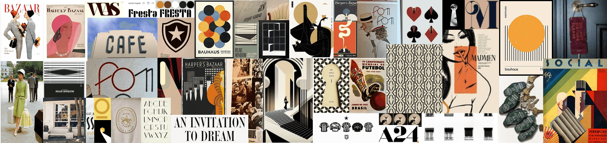
Research_
The research phase was centered on contextual and field analysis rather than formal references. It examined the professional environments in which the identity would operate, the types of content produced, and the symbolic relationship with Fresta, in order to understand where the identity would be activated and which tensions should be avoided.
This investigation pointed to the need for a silent, structured, and precise visual language, one that could dialogue with the studio’s intellectual universe while maintaining formal and discursive independence.
Challenge_
The main challenge of the project was to balance proximity and autonomy. The identity needed to operate within an already established cultural repertoire without visually reproducing it, and without relying on generic or overly expressive graphic solutions. More than an aesthetic problem, the challenge was to define a conscious visual positioning that respected its context while establishing a clear, durable, and independent presence.
Solution_
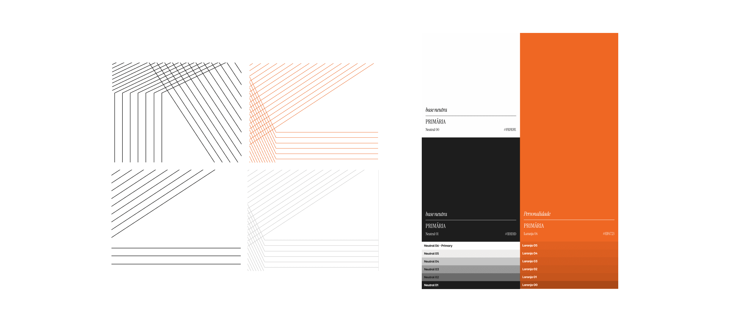
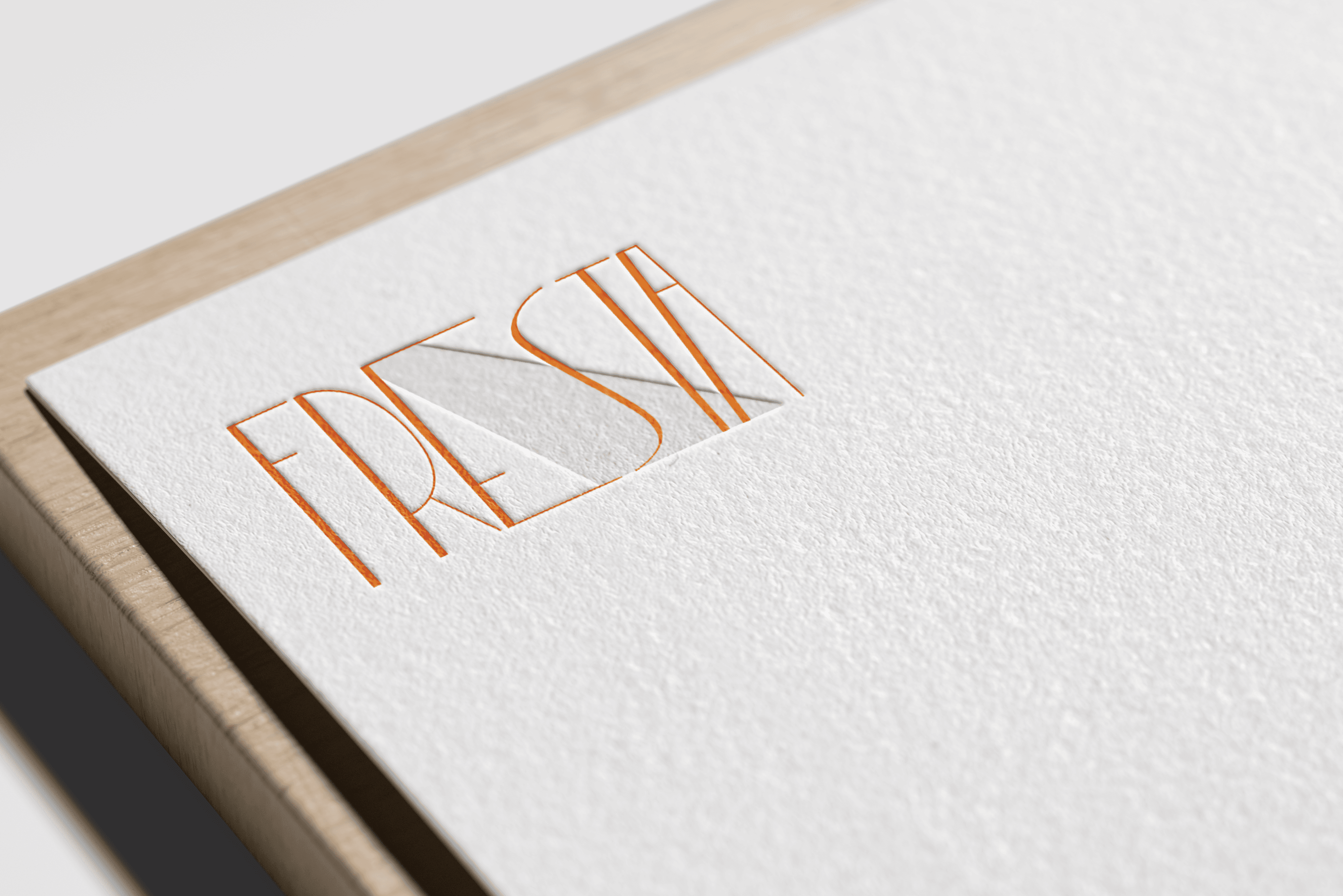
The adopted solution was based on a fundamental strategic decision: not to visually translate Fresta, but to share its structural principles. The identity was conceived as a rational graphic system, where typography, composition, and space function as tools for organizing thought.
The visual language is restrained and precise, prioritizing hierarchy, rhythm, and legibility. Rather than seeking aesthetic protagonism, the system creates a solid foundation for content, discourse, and research to remain at the center of communication.


Results_
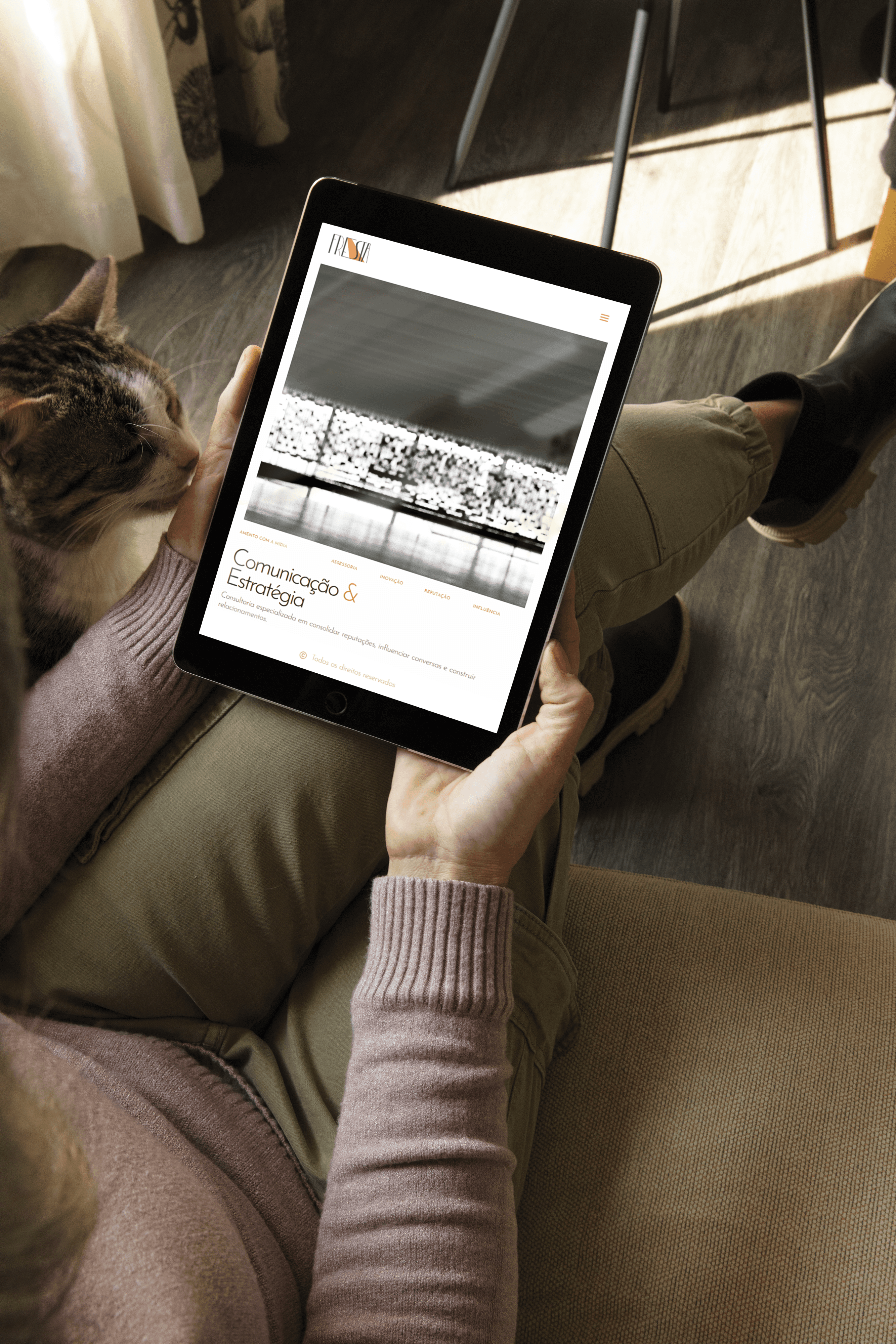
The result is a consistent, functional, and long-lasting visual identity, capable of adapting to different contexts of use such as portfolios, texts, presentations, and editorial materials, without losing conceptual coherence.
More than a graphic signature, the project establishes a visual thinking device aligned with a professional practice oriented toward method, clarity, and critical positioning.
